Home > Informations

I’ve learned that by streamlining the prepress process I am able to pass significant savings onto my clients. My prepress guidelines let me bypass common mistakes made when digital artwork is prepared for print.
Here I show how you can save money when printing.

With quality in mind, all files I send for print are in industry standard:
.ai, .indd, .qxp, .pdf, .eps
Software I use on an almost daily basis include Adobe InDesign, Illustrator, Photoshop and Acrobat, QuarkXPress, and all filetypes created should be accepted by any commercial print company.
Resolution
A commercial printer requires all submitted files to be 300dpi (dots per inch). If you design a job at 72dpi or lower they cannot use the file for print purposes. Their prepress department will resize it to 300dpi therefore “stretching” the image. See the example above where one image was created at 300dpi, and the other was created at 72dpi, then stretched out to 300dpi.
Bleed, trim and safety
Bleed
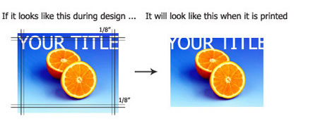
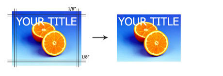
“About 3mm on all sides will be trimmed off. Everything that extends past the original canvas size is considered a bleed. Make sure you do not have any important content in this area. Adjust your canvas size to compensate for this; allow another 3mm. (See Size) Although printer cutting staffs are extremely precise, they usually cannot guarantee any print job cuts with out the added bleed. There are no exceptions. Also, please keep your text at least 6mm away from the edge of the piece unless it is an eighth page or smaller. This way your text is in a “safe” area.”
Trim
“The trim area is a space of 3mm after the bleed. Its purpose is to separate any text or important content from the edge.”
Safety
“The safety area is the space where its “safe” to put your layout, design and content.”


Size
Your print files should be designed in the size that is being ordered. Printers assume that you desire what you have ordered, and files will be re-sized in accordance to the job. A printer will not stretch and enlarge a file unless at your request. For example a 4.25″x5.5″ quarter page ordered as a 4″x6″ postcard will print as a 4″x6″.
Colour
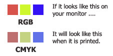
There are two types of colour spaces that are used for graphic and print design:
RGB (Red, Green, Blue)
These are the colours your monitor uses to display everything.
CMYK (Cyan, Magenta, Yellow, Black)
These are the colours used for printing.
Colour shifts are usually not visible in colour photographs. However, rich and solid colours (like a background) can be affected by a colour conversion. Most of the time, colour shifts are minor and may not be noticeable.

Using the colour BLACK
Rich Black
Large, solid black areas and text over 36 points should use Rich Black to prevent the colour looking gray. Rich Black consists of 30% Cyan, 30% Magenta, 30% Yellow, 100% Black. For regular body text, do not use Rich Black.
4 Colour Build Black
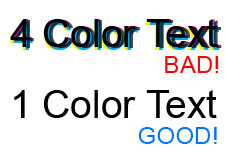
If you have small, thin text on your piece, it is STRONGLY recommended that you do not use 4-colour build black on your piece. Although, using a 4-colour black is recommended on larger areas, using 4-colour text on small areas will make your text blurry and at times, unreadable.
Process printing uses 4 plates that overlay to make your full colour spectrum on your paper. Although precise, the registration of the 4 plates will shift during the print process. If you use all 4 colours to create your black, they will not line-up precisely, creating a ghosting effect.
This is especially evident on small lines, or small text, 12pt and smaller. In order to fix this, all small text should be created as 100% black, 0% Cyan, Magenta, Yellow. This way, as plates shift, it will not affect the black colour.

Fonts
Convert fonts to paths when possible. By converting fonts to paths in programs like Illustrator and FreeHand, you will avoid having to send the fonts with your files. When converting to paths, the text becomes a vector shape and will look no different than its original state.
In Photoshop, text can be rasterized and therefore does not need the fonts. Keep in mind that after rasterizing, no changes can be made to the text.
If your fonts are not converted to paths or rasterized, your design may not be viewed the way it was meant to be seen.
File names
In order to make the pre-flight process more efficient, please use unique file names for files you are submitting. The file name should reflect the job name that was given when ordering. Example: jsmith_4x6_front.pdf
From Web: http://www.davidairey.com/design-guide-for-print/
Contact: Scott Cheung
Phone: 0086-13684906908
Tel: 0086-755-29239218
Email: sales@cnboesy.com
Add: C6 Building, Hengfeng industry area, Zhoushi road, Xixiang, Bao'an, Shenzhen, China